
Certificate in Designing Intuitive Reporting Interfaces
Elevate your skills in creating user-friendly reporting interfaces, enhancing data accessibility and user satisfaction.
Certificate in Designing Intuitive Reporting Interfaces
Programme Overview
The Certificate in Designing Intuitive Reporting Interfaces is a comprehensive program tailored for data analysts, business intelligence professionals, and designers aiming to enhance their skills in creating effective visual representations of data. This program focuses on the principles of human-computer interaction, data visualization, and user-centered design, providing learners with a deep understanding of how to design interfaces that are not only visually appealing but also highly functional and user-friendly. Participants will explore the latest tools and technologies used in data visualization, such as Tableau, Power BI, and D3.js, and learn to apply best practices in data storytelling to communicate complex information effectively.
Key skills and knowledge developed through this program include the ability to analyze user needs, select appropriate visualization techniques, and create interactive dashboards that enhance user engagement and decision-making. Learners will also gain proficiency in data mapping, charting, and storytelling, as well as an understanding of color theory, typography, and layout principles to create visually appealing reports. Additionally, the program covers the use of data analytics to inform design decisions and the importance of accessibility in reporting interfaces.
The career impact of this program is significant, as it equips professionals with the skills necessary to create impactful reports and dashboards that drive business insights and improve organizational performance. Graduates can expect to advance their careers in roles such as data visualization specialist, business intelligence analyst, or UX/UI designer, or take on leadership positions in data-driven product development. They will be well-prepared to lead projects that require the design and
What You'll Learn
Discover the power of clear communication with our Certificate in Designing Intuitive Reporting Interfaces. This comprehensive program equips you with the skills to create visually appealing and user-friendly reports that transform raw data into actionable insights. You'll delve into the psychological principles of design, learn to use tools like Tableau and Power BI, and master the art of storytelling through data visualization.
By the end of the program, you will be able to design interfaces that not only look great but also enhance user experience, ensuring that decision-makers can quickly grasp complex information. Graduates apply these skills in a variety of settings, whether in corporate environments, non-profits, or startups, where the ability to communicate data effectively is crucial.
This certificate opens doors to a range of career opportunities, including Data Analyst, Business Intelligence Developer, and Information Designer. Whether you're a seasoned professional looking to enhance your skill set or a newcomer eager to enter the data-driven world, this program provides the foundational knowledge and practical skills needed to excel. Join us and become a master in designing intuitive interfaces that drive informed decision-making.
Programme Highlights
Industry-Aligned Curriculum
Developed with industry leaders for job-ready skills
Globally Recognised Certificate
Recognised by employers across 180+ countries
Flexible Online Learning
Study at your own pace with lifetime access
Instant Access
Start learning immediately, no application process
Constantly Updated Content
Latest industry trends and best practices
Career Advancement
87% report measurable career progression within 6 months
Topics Covered
- Foundational Concepts: Covers the core principles and key terminology.: User Psychology: Examines how users interact with interfaces and cognitive processes.
- Data Visualization: Introduces effective methods for data representation.: Interface Design: Focuses on creating intuitive user experiences.
- Tools and Technologies: Reviews software and tools for designing reports.: Case Studies: Analyzes real-world examples of intuitive reporting interfaces.
What You Get When You Enroll
Key Facts
Audience: Data analysts, UI/UX designers
Prerequisites: Basic understanding of data visualization
Outcomes: Create user-friendly reports, enhance data comprehension
Ready to get started?
Join thousands of professionals who already took the next step. Enroll now and get instant access.
Enroll Now — $79Why This Course
Enhanced Career Opportunities: Acquiring a Certificate in Designing Intuitive Reporting Interfaces can significantly boost career prospects in data visualization and business intelligence. This certification equips professionals with the skills to create clear, actionable reports that can drive informed decision-making. For instance, it enables them to design dashboards that are not only visually appealing but also user-friendly, leading to higher engagement and better data interpretation.
Skill Development in Data Visualization: The certificate program focuses on developing skills in data visualization techniques and tools. Professionals learn to effectively communicate complex data through charts, graphs, and other visual elements. This capability is crucial in today’s data-driven world, where the ability to present data in a digestible format can make the difference between insightful analysis and confusion. Tools like Tableau, Power BI, and D3.js are often covered, providing a solid foundation in modern data visualization practices.
Improved Data Interpretation and Communication: A key aspect of the certification is learning how to interpret data and communicate findings effectively. Professionals gain the ability to transform raw data into meaningful insights that can inform strategic decisions. This skill is particularly valuable in roles where data storytelling is essential, such as in marketing, finance, and healthcare. By mastering these skills, professionals can enhance their ability to influence stakeholders and drive positive outcomes.
3-4 Weeks
Study at your own pace
Course Brochure
Download our comprehensive course brochure with all details
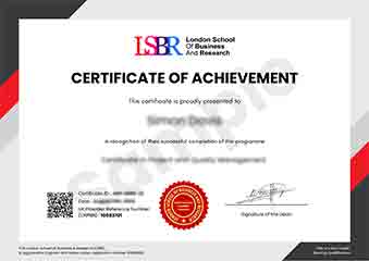
Sample Certificate
Preview the certificate you'll receive upon successful completion of this program.
Employer Sponsored Training
Let your employer invest in your professional development. Request a corporate invoice and get your training funded.
Request Corporate InvoiceYour Path to Certification
From enrollment to certification in 4 simple steps
instant access
pace, anywhere
quizzes
digital certificate
Join Thousands Who Transformed Their Careers
Our graduates consistently report measurable career growth and professional advancement after completing their programmes.
What People Say About Us
Hear from our students about their experience with the Certificate in Designing Intuitive Reporting Interfaces at LSBR Executive - Executive Education.
Charlotte Williams
United Kingdom"The course content is incredibly comprehensive, covering all the essential aspects of designing intuitive reporting interfaces with real-world examples that truly enhance practical skills. Gaining insights into user experience and interface design has been invaluable for my career in data visualization."
Mei Ling Wong
Singapore"This course has been incredibly valuable in enhancing my ability to design user-friendly reporting interfaces that meet real-world business needs. It has not only deepened my technical skills but also provided me with practical tools to advance my career in data visualization and analytics."
Kai Wen Ng
Singapore"The course structure is well-organized, providing a clear path from basic principles to advanced techniques in designing intuitive reporting interfaces, which significantly enhances my understanding and practical skills in the field. The comprehensive content and real-world applications have been invaluable for my professional growth, equipping me with the knowledge to create more effective and user-friendly reports."